Click to view full images.
Awake Since June 24th
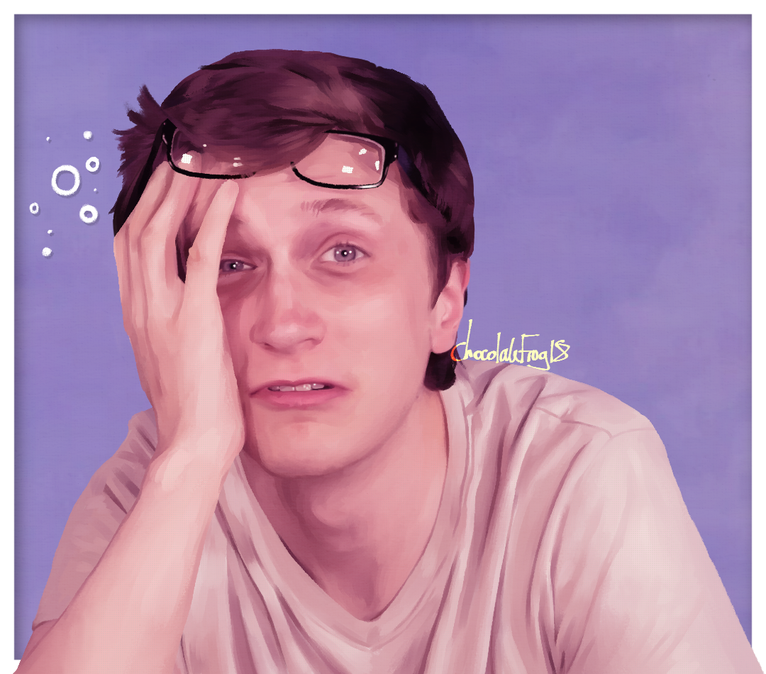
Even though this one is getting a little old now, I still love it. First of all, the
purple/pink tint I think really makes it so stylish. The way I put down the brushstrokes... I have
tried to recreate many times since but I just can't do it! I'm not sure what wizardry I was using
but this style of painting rendering is my favourite, and I'm glad I got to manage it in my own work
at least once-- I'm happy that this was the painting that got that kind of treatment. Styled, yet
realistic. Combined with those colours and it just makes me so pleased with the final painting.
Finally, Scott himself. I like painting him without his glasses because it just changes his
expression and his face so much. This screenshot was great and I felt like I just had to recreate it
myself.
Jeb
THIS TOOK SO LONG! There was a conversation about what
characters would wear vs. what actors would wear. I was a 'Jeb would probably wear Hawaiian shirts'
believer. I dug out three of my own shirts and asked what everyone thought... This shirt won pretty
unanimously, so I got to work. It was difficult due to my shortage of good reference photos of Sam,
as well as the fact I was 'photoshopping' this shirt of mine onto him. Matching these things up is
difficult, especially when it comes to lighting! When it was done after many months, I was not
expecting Sam to see it! I got the notification that he had replied to my Reddit post and I promptly
had a heart attack.
THANK YOU SAM
Closed In
This was made during the 'Woztober' drawing challenge in 2022. I was very happy to have
an excuse to draw a spooky Scott. I found the best spooky reference photo I could and immediately
had an idea-- something I had already been considering before October and before I saw the art
prompt list. Some kind of 'Borderline Forever Bad Ending' or whatever you want to call it.
Basically, a kind of 'Border-Possessed' Scott. I was a little hesitant at first, because I knew that
successfully pulling off realistic-looking blue blood and making his eyes look *that* blue without
just looking like a filter would be hard. The final painting didn't come out exactly how I wanted it
to, but I completed this in just one day and I'm still happy with how it looks. It also succesfully
shows off my idea, so that's a win.
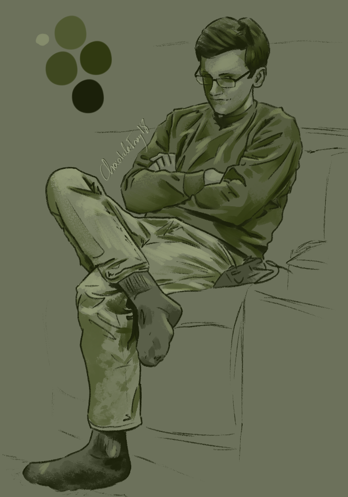
the sore loser
I painted this after the Mario Kart Wii tournament. We all watched it together, as it
was a premiered video. There was a lot of team spirit, since we had all decided on teams after the
video was announced and had decked out our profiles with our own custom team badges and banners. I
was Team Sam! Before the tournament, I declared that I was vehemently against Team Scott, who, in
turn, declared war back. Good times. Scott did, in fact, lose poorly, which was incredibly funny
during the course of the video, as his team slowly began to lose their hope. Then Scott sat like
this and pouted. Immediately, I knew I had to paint this moment. That expression and body
language... I couldn't ask for a better painting inspiration. Again, I tried testing the waters with
a stylized yet realistic style. I also didn't want to spend too long on it, so I kept it as simple
as possible. The sketch was roughly and quickly blocked out, then I moved on to painting, using only
one brush. I also gave myself a limited colour palette of greens to use. The idea of green=envy only
came to me afterwards, but if anyone asks I will say that was an intentional thematic colour choice.
I believe that the combination of the style that I went with and the expression of the painting
resulted in this becoming one of my favourite pieces of art. It turned out so well!
Eric
This frame of Eric from the bloopers of Toys To Life really stood out to me. I wanted to
paint him!! Once again, I was in one of my moods to paint using purple/pink tinted colours. I kept
the rendering rough in some places while focusing on high details in others. Together I think this
creates a subtly stylized realistic style. Perfect-- just what I wanted. I experimented with leaving
the sketch layer visible as I painted over it; you can still see it around the edges, which I like.
Of course, I dedicated it to two of the biggest Eric fans I know. But the only excuse I really need
to paint Eric is a good photo of him! The only thing that keeps my Scott bias high in my paintings
is the fact that I just have more reference photos of him, compared to everyone else...
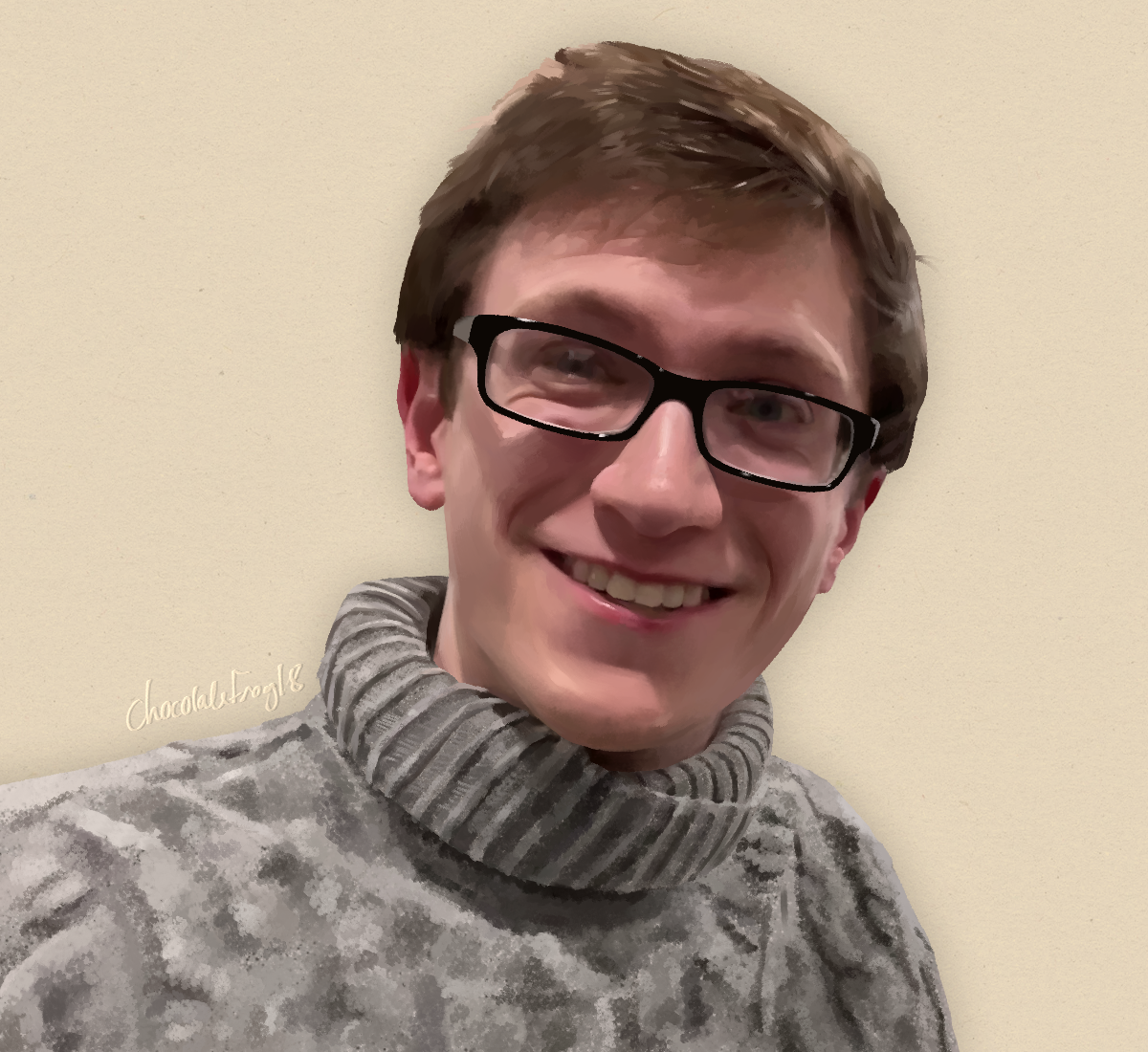
Cosy
I started painting this as soon as the source video came out... but it took many months
to finish. I didn't even sketch it-- I just started painting. Terrifying! This was started around
the same time as the 'Jeb' painting, so I'm happy both of these ended up being favourites. Of
course, I picked this frame to paint just because it had such a good vibe to it. Scott has a such a
gentle expression, yet the dark shadows across his face and eyes would ordinarily create the
opposite of this feeling. The end result is such an oddly friendly look that had me hooked on
recreating it. Additionally, I was very interested in painting the texture and pattern of the
turtleneck sweater that he was wearing. Initially, I considered altering the colours of the photo,
but changed my mind as I found the original colours worked well for what I wanted, and would be
better left unchanged. I was also originally going to paint his arm too (which can be seen in the
timelapse) but I kept it to just a bust instead. For a while, I had this as my Discord profile
picture, I liked it so much!
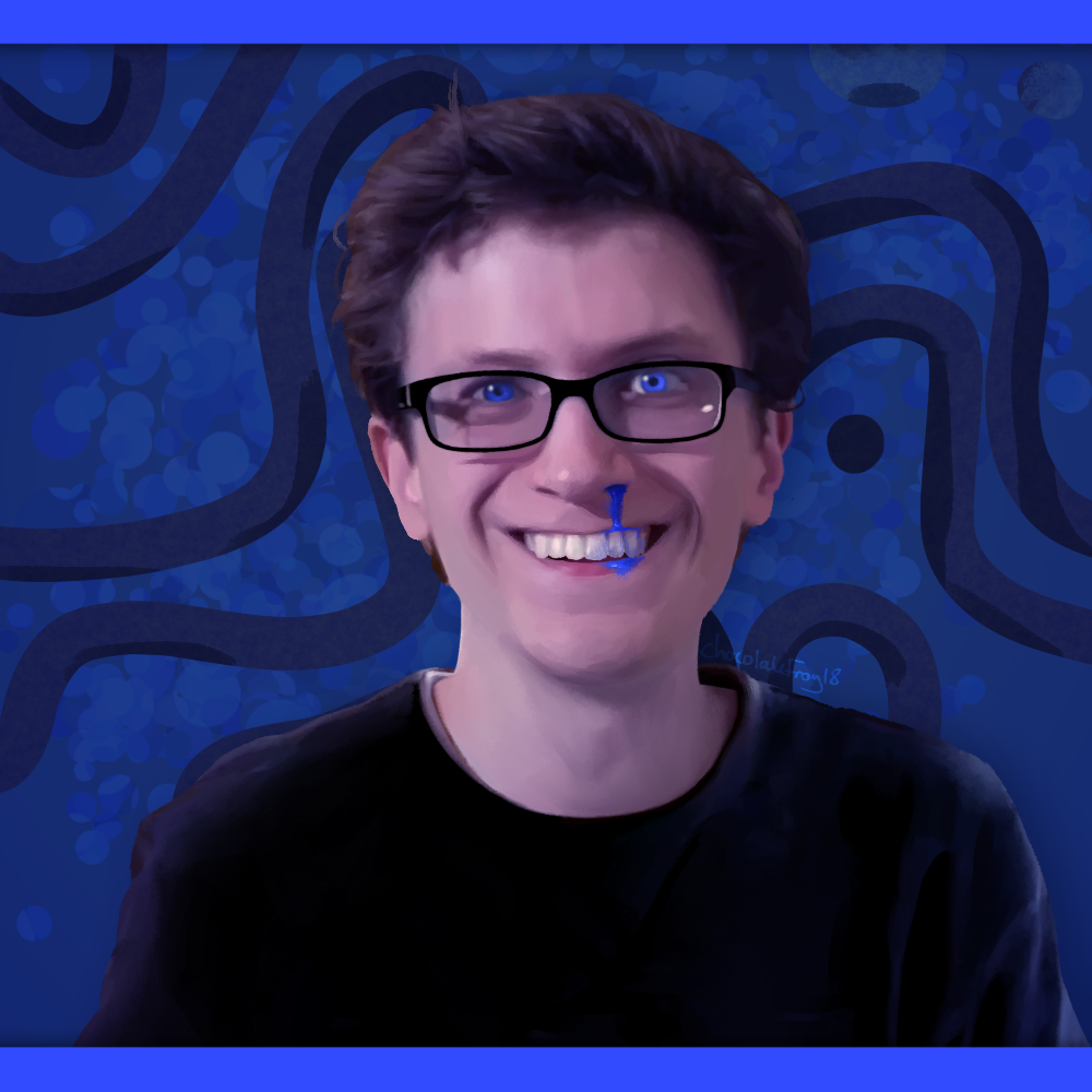
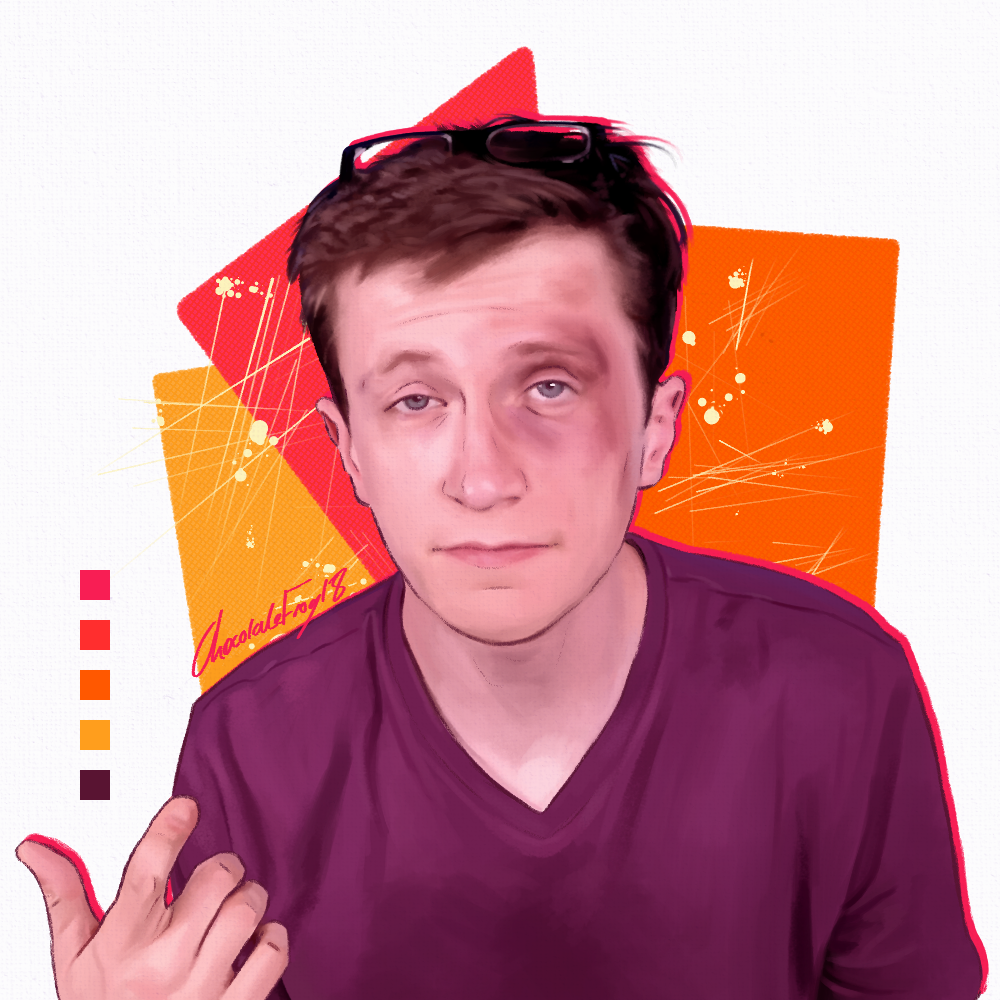
Nerd Gets Ass Beat
Another instance of me painting Scott without his glasses. I started painting this while
I was still watching the episode as it released. I was always intending on painting at least one
thing from this episode, and when this popped up on my screen I knew this was it. Yet again, I went
with a purple tint, but it especially made sense this time with the bright purple shirt-- which I
actually dimmed a little. This is another example of me experimenting with leaving my sketch layer
visible as well as also trying out that 'rough but detailed' style. Finally, I knew I needed an
interesting background to really make it pop. I've painted Scott so many times-- how could I make
this one in particular stand out? I went with some bright colour picks, and made a palette out of my
choices. Shapes were the first thing that came to mind, then some texture. I got some second
opinions and then added the inky 'scratches' and blobs, which brought it together. Finally, I gave
Scott a bright outline on one side, kept the palette visible, and signed my name.
The Scariest Time of Year
This originates from about a minute and a half into the Halloween special 'Candy Games'.
Over Halloween, I was actually on vacation in the highlands in Scotland. Also during this time was
that brief limbo where the daylight savings makes Scott The Woz episodes come out at 12am over here
instead of the usual 1am. So, like a dork, I stayed up to watch even though we were going out hiking
real early in the morning. Of course it came out late. And of course it released just as I was about
to give up and sleep. I saw this frame and wanted to paint it but I was on VACATION with no d0rawing
materials... Sigh. I decided to get it done when I got back home to my drawing tablet. And I wanted
to spice up the colours a little to make it more interesting... But Scott did most of the work with
the great lighting for this one. Also it was totally a warmup piece before I decided to go all out
with it.

Cereal Smirk
I don't usually think anything special of my pencil sketches, but with this one in
particular I really liked how it came out. Unfortunately it's from a secret unlisted video... sorry
to everyone who I have spoiled because of this. I think the thing that really makes this one pop
besides Scott's expression is the thick outline. This was a spur-of-the-moment choice and I'm very
happy I decided to do it. However, often I consider changing the background from my neutral grey
doodling paper colour to something else... but whenever I edit it, it doesn't seem quite right
anymore. For now, I am content to leave it how it is. I think that choosing to use this reference
photo to paint a pencil sketch with was a good choice, since it just works well together.
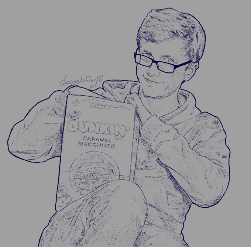
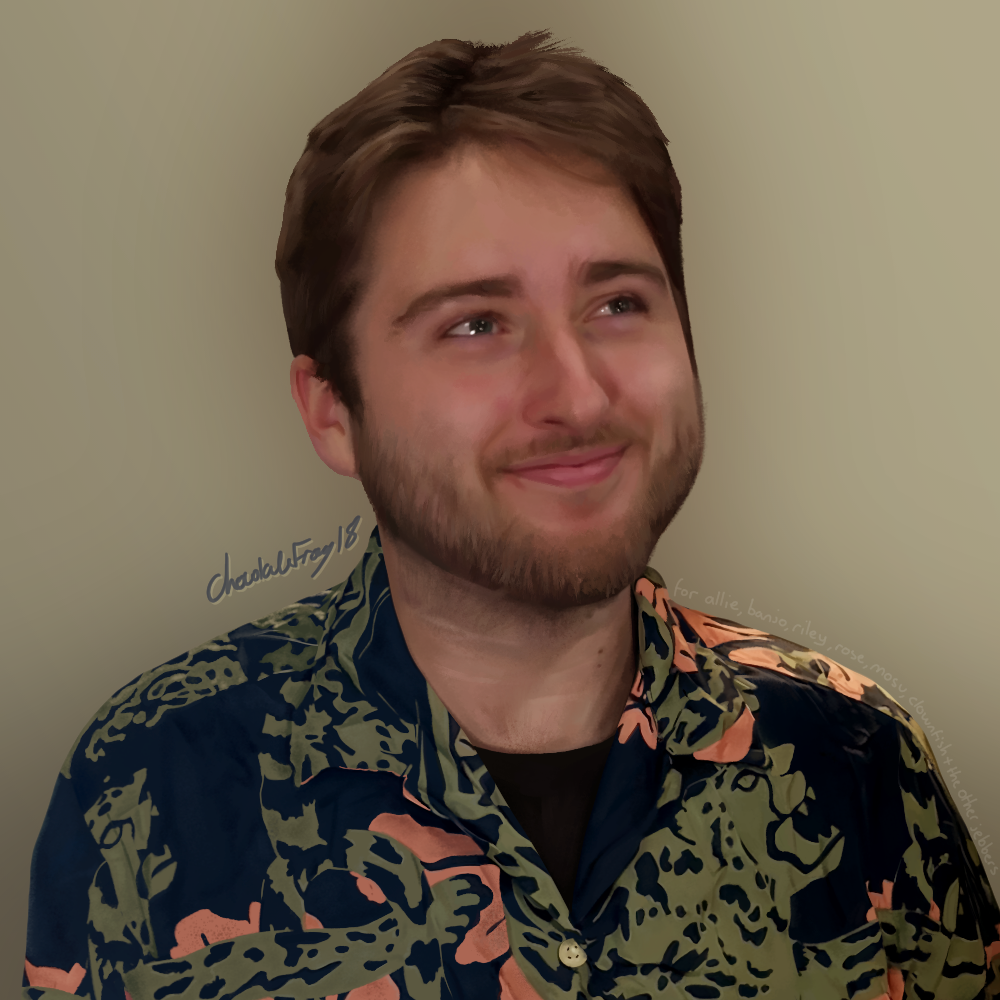
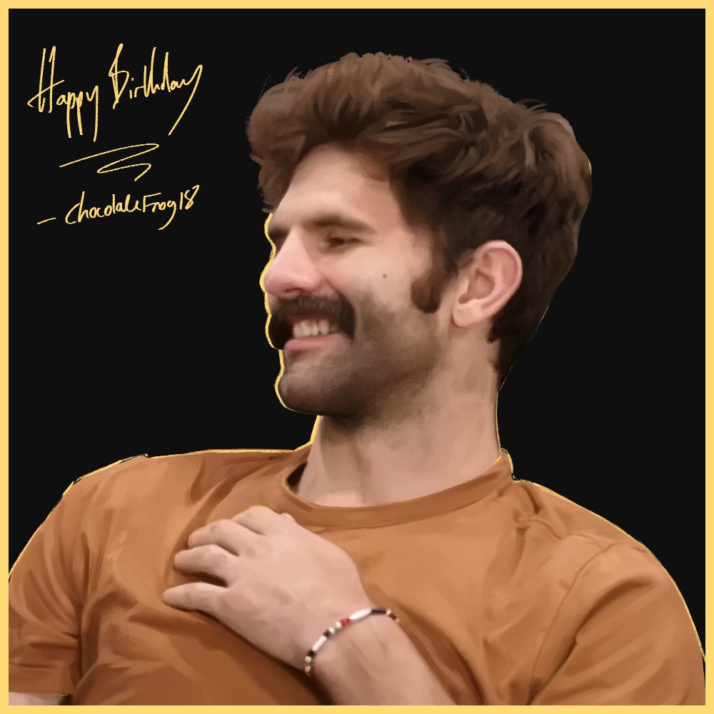
Justin
I painted this for Justin's birthday!! In only a few hours-- a
very daunting task. I had started it the day before but did the vast majority of the work ON THE
DAY! Afterwards, I had to take a long, long break. But I'm glad I got it done on time. I can only
assume from Justin's response that he appreciated the gift, which is all I need to be happy with
this one. A gift well-received is a win in my book any day of the week. I mainly stuck to using just
one kind of brush. Parts of the shirt and hair I decided to keep roughly rendered, while saving the
detail for his face. I kept the sketch visible but then added on some extra outlines on the left to
give it some extra style. I found that painting on the black background was actually very helpful!
I've been doing this a lot since.
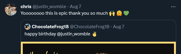
THANK YOU JUSTIN
Persona 5 Portrait
Another piece of art made during the 'Woztober' drawing challenge in 2022. However again
I had the idea before then. I had this ready to post for the day that the Steam version of the game
would be releasing. Since I don't own a PlayStation and so don't own the game... I had to work hard
to get my research right for this. I wanted this to be as accurate as possible to other character
portraits that are featured in the game. I studied the style as best as I could, looking over all of
the other art from the game files that I had to scrounge up off the Internet. I also stole many
clips from other people's YouTube playthroughs so that I could watch how the animation frames moved.
It was such a great feeling to have something like this be completed in only a matter of hours, as I
spend so much time painting sometimes... It's nice to finish something in less than a day while
working at a relaxed pace. I am incredibly happy with how the final portrait turned out. Moving on
to the animation... it was much easier than anticipated, although I did run into some frustrating
technical problems with the transparent gif, which I fixed later.

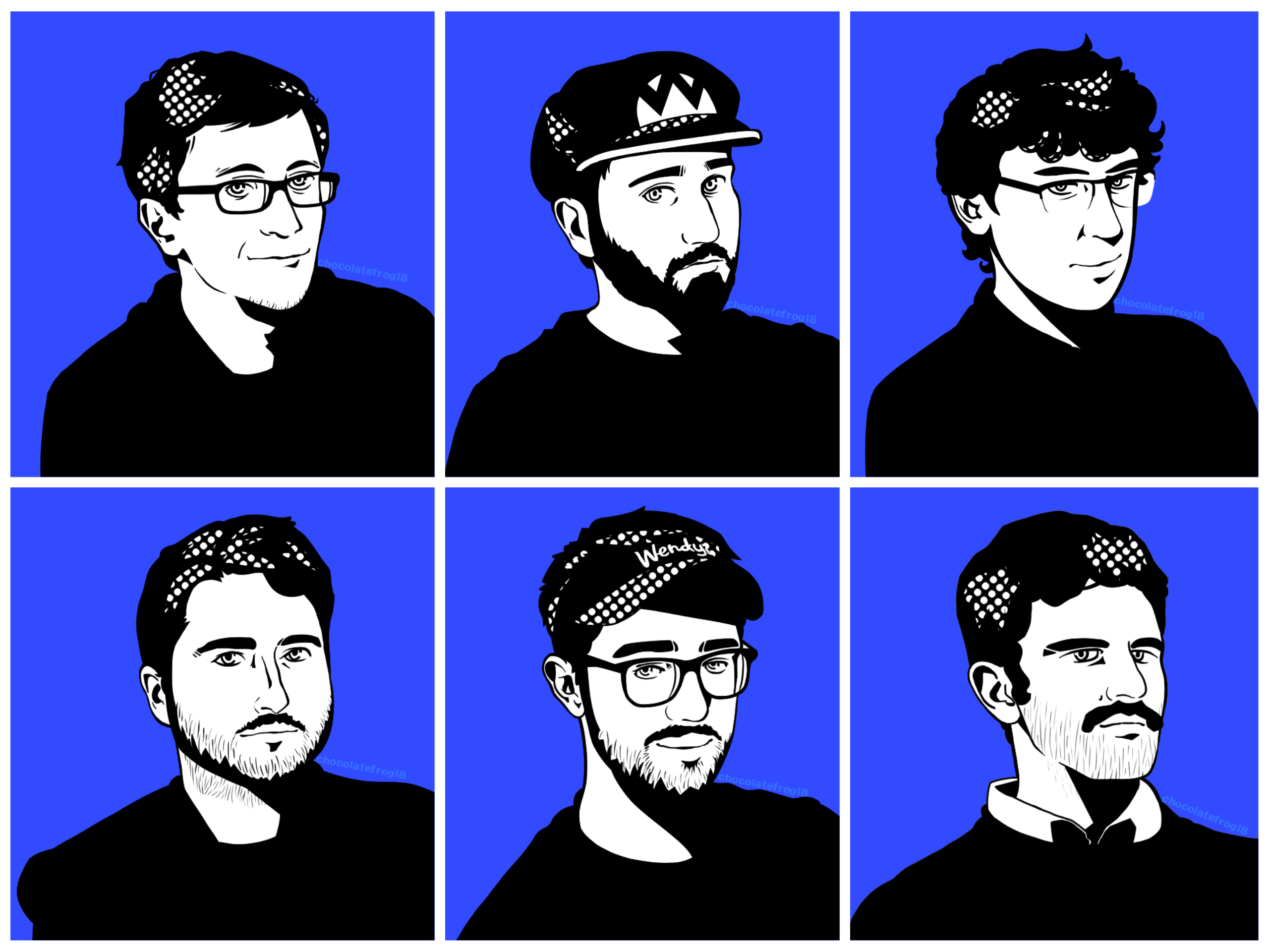
Persona 5 Confidants
While I wasn't willing to create full character portraits for everyone (again, my Scott
bias results from my lack of decent reference photos of everyone else), I did want to include
someone other than Scott in my Person 5 style experimentations. I decided on Scott, Jeb, Rex, Target
Employee, Terry and Jerry. I studied the source art for a stupidly long time in order to get this as
accurate as I possibly could. Everyone except Jerry was completed in under two hours over the course
of a few days. I procrastinated on Jerry and completed him a month later in time for the 'Woztober'
2022 drawing challenge. This version is a collage of the separate portraits, which I then cropped
and added the blue background to so that I could display it easier. While I created the art, I did
not go as far as thinking how these confidants could fit into the game... Someone else can go and
work that out.
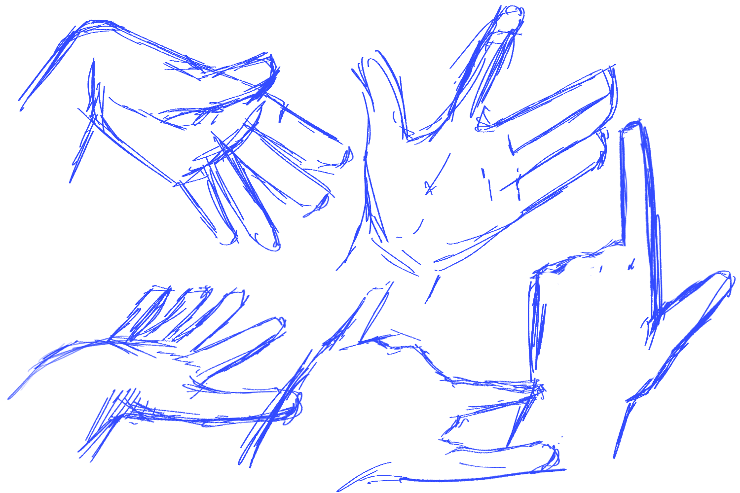
Hand Observations
These hand observations were drawn very quickly as part of a drawing warmup game. The
idea is that you quickly draw a few things from real life (NOT photos) in order to warm up your
hands and your eyes for actual artwork. The rules are that you only have 10 minutes and that you can
only use what you have directly in front of you, in your workspace etc. Use of an eraser is
discouraged, but still allowed. I made these when introducing some friends to the game, and I got a
lot of people involved in trying it out themselves in a hand-themed round at this. All of these are
my hands, and all of them were made in about five minutes from just holding up my hand in front of
me and then drawing it in different poses. Makes for great practice, and a great way to warmup.
Eye Observations
Similar to the previous hand observations, these were done as part of the warmup game.
This round was eye-themed instead of hand-themed. In this case, using a phone camera was allowed if
you didn't have a mirror. These are all my eyes, with the bottom one featuring some of my
nosebridge, too. Most people find hands to be harder to draw than eyes, but for me it's the other
way around.
darker side
From the name, you may guess that this was inspired by Super Mario Odyssey. The sky in
this kingdom is absolutely beautiful. It really shows off the stunning beauty of outer space.
depth
I love painting space. Often, I don't manage to paint it just how I want it to. Here, it
is exactly how I wanted it to look. I painted this using a free trial of Photoshop on my first time
opening the program.


